Automatic UI (sliders, buttons, etc.) generated from annotated classes and properties. Uses orx-panel and orx-parameters.
A quick-and-dirty user interface toolkit.
orx-gui uses class and property annotations to generate simple interfaces. The annotations used
are provided by orx-parameters and most filters in orx-fx have been annotated.
orx-gui is made with an orx-olive workflow in mind but can be used in normal OPENRNDR programs
just as well.
Preparation: make sure orx-gui is in the orxFeatures of your project (if you working on a template based project)
The essence of orx-gui lies in the provided a GUI extension, which can be used in your program using the extend {} function.
The GUI class has an add() function that allows any annotated object to be passed in.
The visibility of the side bar can be toggled by pressing the F11 key on your keyboard.
A simple UI can be created by creating an annotated object.
import org.openrndr.application
import org.openrndr.extra.gui.GUI
import org.openrndr.extra.parameters.*
import org.openrndr.math.Vector2
import org.openrndr.math.Vector3
import org.openrndr.math.Vector4

enum class Option {
    Option1,
    Option2,
    Option3
}


fun main() = application {
    program {
        // -- this @Description annotation is optional
        val parameters = @Description("parameters") object {
            @DoubleParameter("radius", 20.0, 200.0, precision = 2, order = 0)
            var radius = 50.0

            @TextParameter("A string", order = 1)
            var s = "Hello"

            @BooleanParameter("A bool", order = 2)
            var b = true

            @IntParameter("An int", 0, 127, order = 3)
            var i = 64

            @ColorParameter("A fill color", order = 4)
            var fill = ColorRGBa.PINK

            @XYParameter("Position", minX = 0.0, maxX = 640.0,
                                     minY = 0.0, maxY = 480.0, order = 5)
            var pos = Vector2.ZERO

            @Vector2Parameter("A Vector2", order = 6)
            var v2 = Vector2(200.0, 200.0)

            @Vector3Parameter("A Vector3", order = 7)
            var v3 = Vector3(200.0, 200.0, 200.0)

            @Vector4Parameter("A Vector4", order = 8)
            var v4 = Vector4(200.0, 200.0, 200.0, 200.0)

            @DoubleListParameter("Mixer", order = 9)
            var mixer = MutableList(5) { 0.5 }

            @ActionParameter("Action test", order = 10)
            fun clicked() {
                println("GUI says hi!")
            }

            @OptionParameter("An option", order = 11)
            var option = Option.Option1
        }

        extend(GUI()) {
            add(parameters)
        }
        extend {
            drawer.fill = parameters.fill
            drawer.circle(parameters.pos, parameters.radius)
        }
    }
}In a similar fashion to the previous example we can create a simple UI for most filters in orx-fx
import org.openrndr.application
import org.openrndr.color.ColorRGBa
import org.openrndr.draw.isolatedWithTarget
import org.openrndr.draw.renderTarget
import org.openrndr.extra.fx.blur.BoxBlur
import org.openrndr.extra.gui.GUI

fun main() = application {
    program {
        val blur = BoxBlur()
        val rt = renderTarget(width, height) {
            colorBuffer()
        }
        extend(GUI()) {
            add(blur)
        }
        extend {
            drawer.isolatedWithTarget(rt) {
                drawer.background(ColorRGBa.BLACK)
                drawer.fill = ColorRGBa.PINK
                drawer.circle(width / 2.0, height / 2.0, 200.0)
            }
            blur.apply(rt.colorBuffer(0), rt.colorBuffer(0))
            drawer.image(rt.colorBuffer(0))
        }
    }
}Using orx-gui in Olive (orx-olive) is very similar to how one would use it in a normal OPENRNDR program. There is
one detail that doesn't occur in normal programs: the UI state is reset when a
script is changed and re-evaluated. This is overcome by using an annotated Reloadable object.
An example live.kts script that uses orx-gui and Reloadable:
@file:Suppress("UNUSED_LAMBDA_EXPRESSION")
import org.openrndr.Program
import org.openrndr.extra.gui.GUI
import org.openrndr.extra.olive.Reloadable
import org.openrndr.extra.parameters.DoubleParameter

{ program: Program ->
    program.apply {
        val p = object : Reloadable() {
            @DoubleParameter("x-position", 0.0,  640.0, order = 0)
            var x = 0.5
            @DoubleParameter("y-position", 0.0, 480.0, order = 1)
            var y = 0.5
            @DoubleParameter("radius", 0.0, 480.0, order = 2)
            var radius = 100.0
        }
        p.reload()

        extend(GUI()) {
            add(p)
        }
        extend {
            drawer.circle(p.x, p.y, p.radius)
        }
    }
}orx-gui is based on a proof-of-concept by Ricardo Matias
Demonstrates how to add and remove object instances from a gui.
The instances have three parameters: a 2D position, a color, and a radius.
Click an empty area in the canvas to add visible circles. Each circle is also added to the gui, making it possible to adjust its properties.
Click an existing circle to remove it from the collection and from the gui.
Advanced demonstration on how to add and remove filters from a collection and from a GUI.
The program draws 10 circles and then applies the Post() filter.
Initially, the filters collection to apply is empty.
To add filters, press one of the "bgaphcde" keys in the keyboard.
Press the DELETE key to remove the most recently added filter.
Pressing the "s" key shuffles the order in which the filters are applied. This will rarely produce interesting visual effects, but it reveals that the filter's order of application can be modified after creation. Note that the order in the gui will not change.
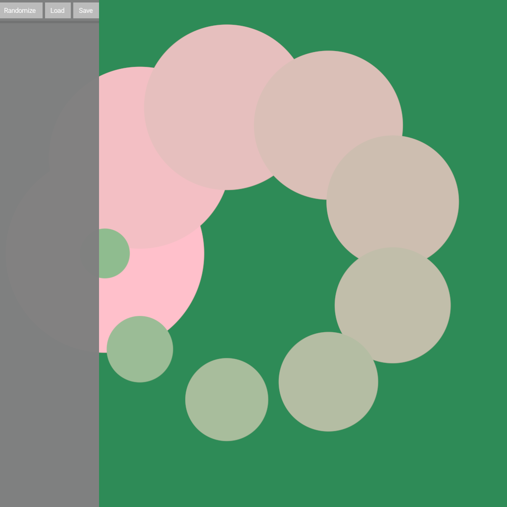
Demonstrates how to customize the appearance of the GUI by using
GUIAppearance().
In this demo, we make the GUI wider (400 pixels) and translucent.
Demonstrates how to customize the appearance of the GUI by using
GUIAppearance() and defaultStyles().
This demo not only changes the background color and the panel width, but also the widget colors and font size.
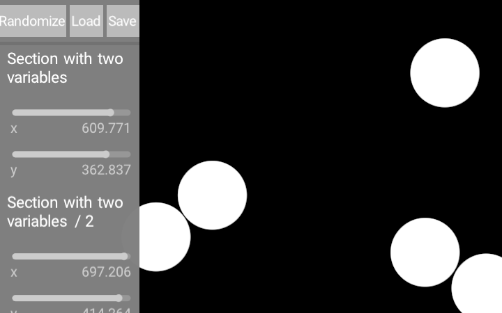
Demonstrates using collapsible compartments in the GUI. Each one has a description visible (and clickable) in the panel.
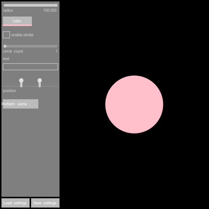
Demonstrates how to hide the GUI when the mouse pointer is outside of it.
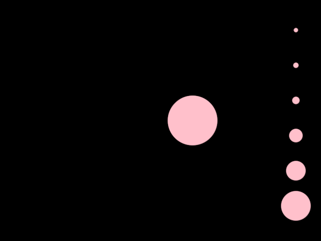
A simple demonstration of a GUI with a drop-down menu.
The entries in the drop-down menu are taken from an enum class.
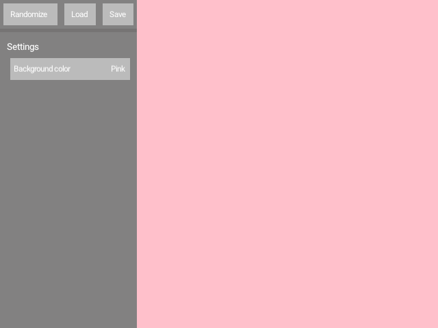
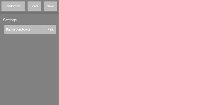
A simple demonstration of a GUI with a drop-down menu.
The entries in the drop-down menu are taken from an enum class.
The enum class entries contain both a name (used in the drop-down)
and a ColorRGBa instance (used for rendering).
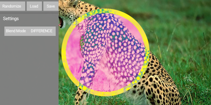
A simple demonstration of a GUI with a drop-down menu.
The entries in the drop-down menu are taken from the BlendMode enum class.
The selected blend mode is used to render a circle on top of an image.
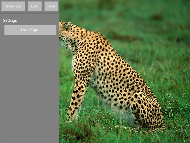
Demonstrates how to include a button for loading images in a GUI, and how to display the loaded image.
The program applies the @PathParameter annotation to a String variable, which gets
rendered by the GUI as an image-picker button. Note the allowed file extensions.
This mechanism only updates the String containing the path of an image file.
The watchingImagePath() delegate property is used to automatically load an image
when its String argument changes.
Shows how to store and retrieve in-memory GUI presets, each containing two integer values and two colors.
Keyboard controls: [Left Shift] + [0]..[9] => store current GUI values to a preset [0]..[9] => recall a preset
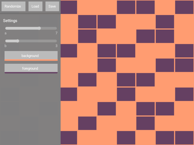
Demonstrates the GUI.enableSideCanvas feature.
When set to true, the GUI provides a canvas property where one can draw.
The size of this canvas is the window size minus the GUI size.
That's why if we draw a circle at drawer.width / 2.0 it is centered
on the canvas, not on the window.
This demo sets the window to resizable, so if you resize the window you should see tha the circle stays at the center of the canvas.
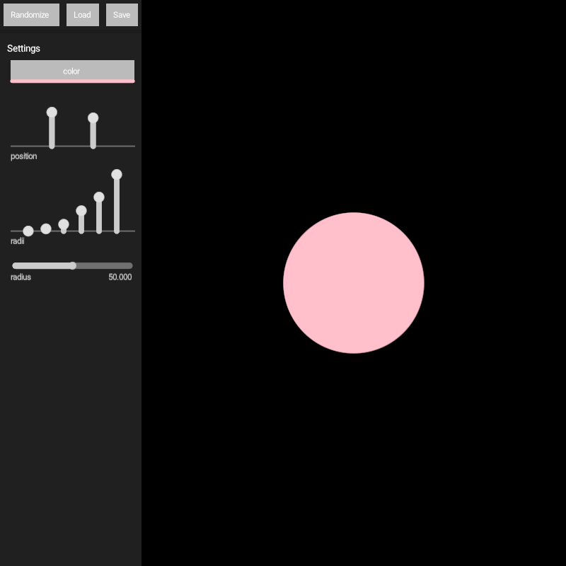
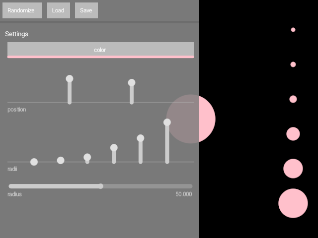
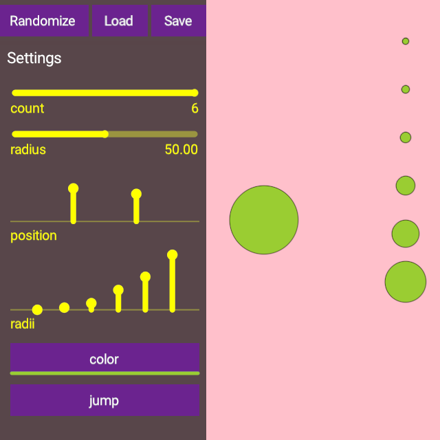
Demonstrates how to create a simple GUI with 4 inputs:
- A
ColorParameterwhich creates a color picker. - A
DoubleParameterto control the radius of a circle. - A
Vector2Parameterto set the position of that circle. - A
DoubleListParameterwhich sets the radii of six circles.
The demo also shows how to use the variables controlled by the GUI inside the program, so changes to those variables affect the rendering in real time.

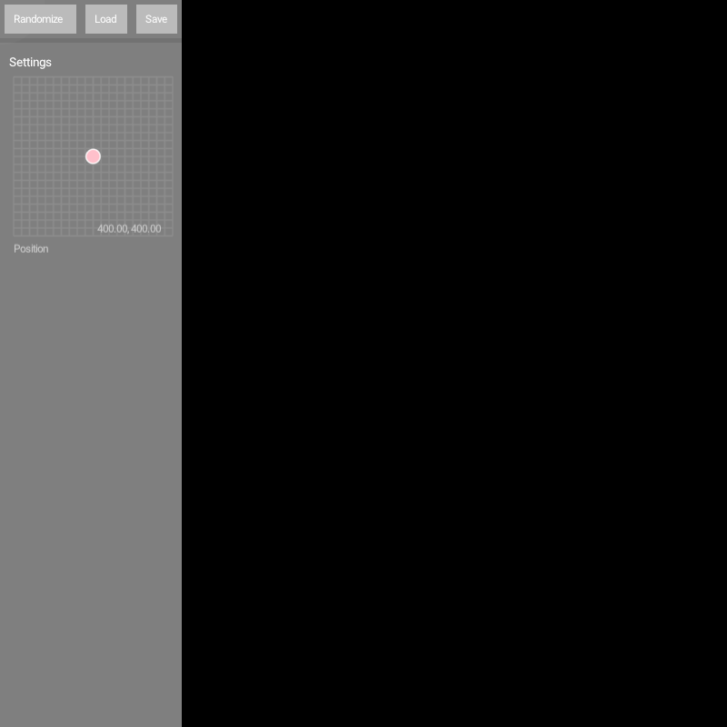
Demonstrates the use of the @XYParameter annotation applied to a Vector2 variable.
This annotation creates an interactive XY control in a GUI that can be used to update
a Vector2 variable. In this demo it sets the position of a circle.