feat(ui-tag): new Tag v3 implementation - #2687
Conversation


 git-nandor
changed the title
git-nandor
changed the title

|
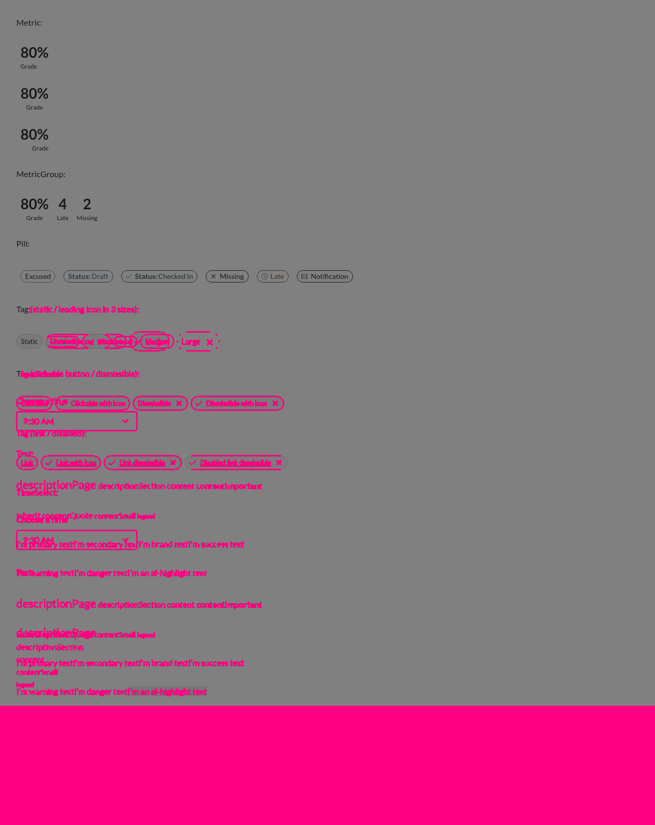
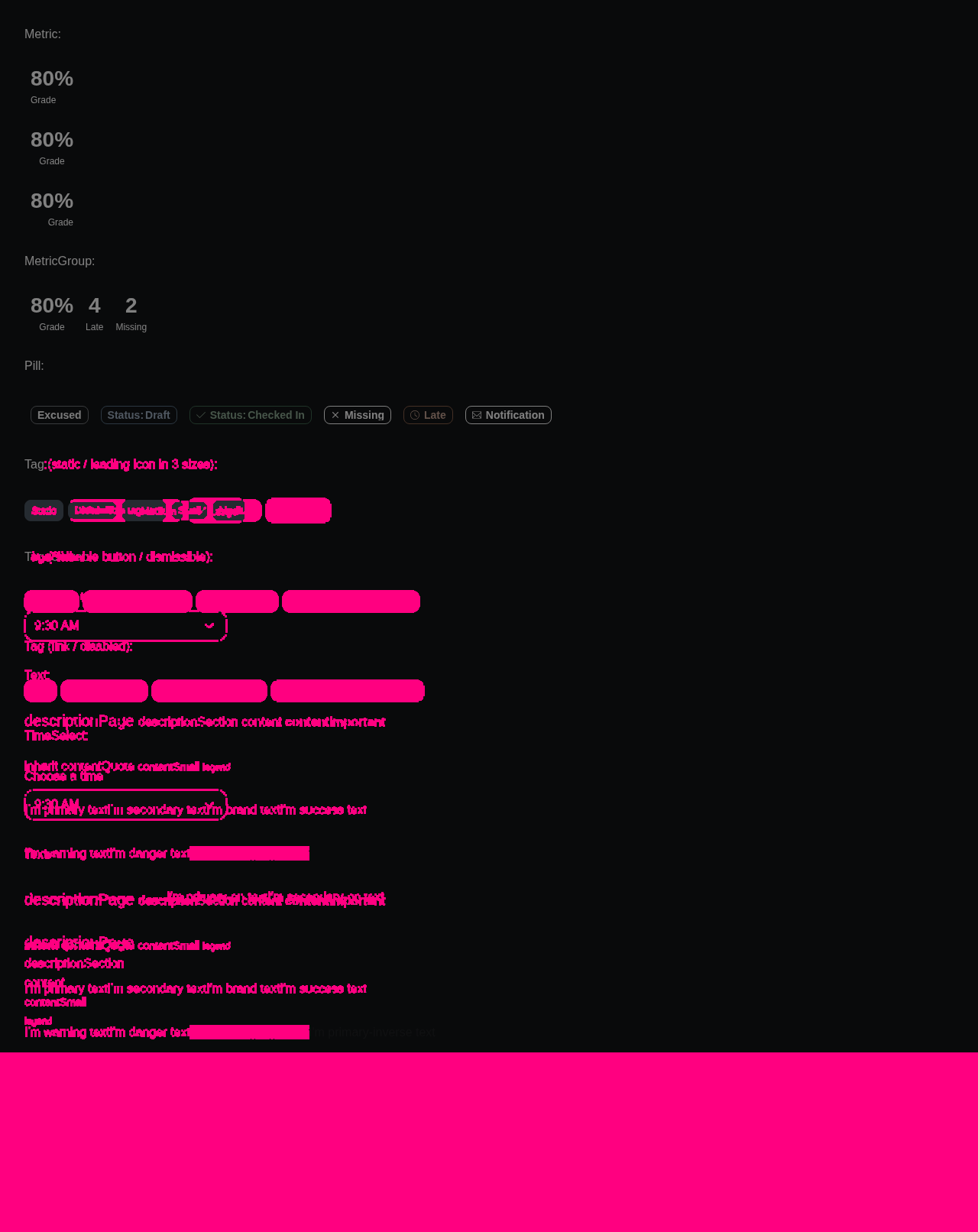
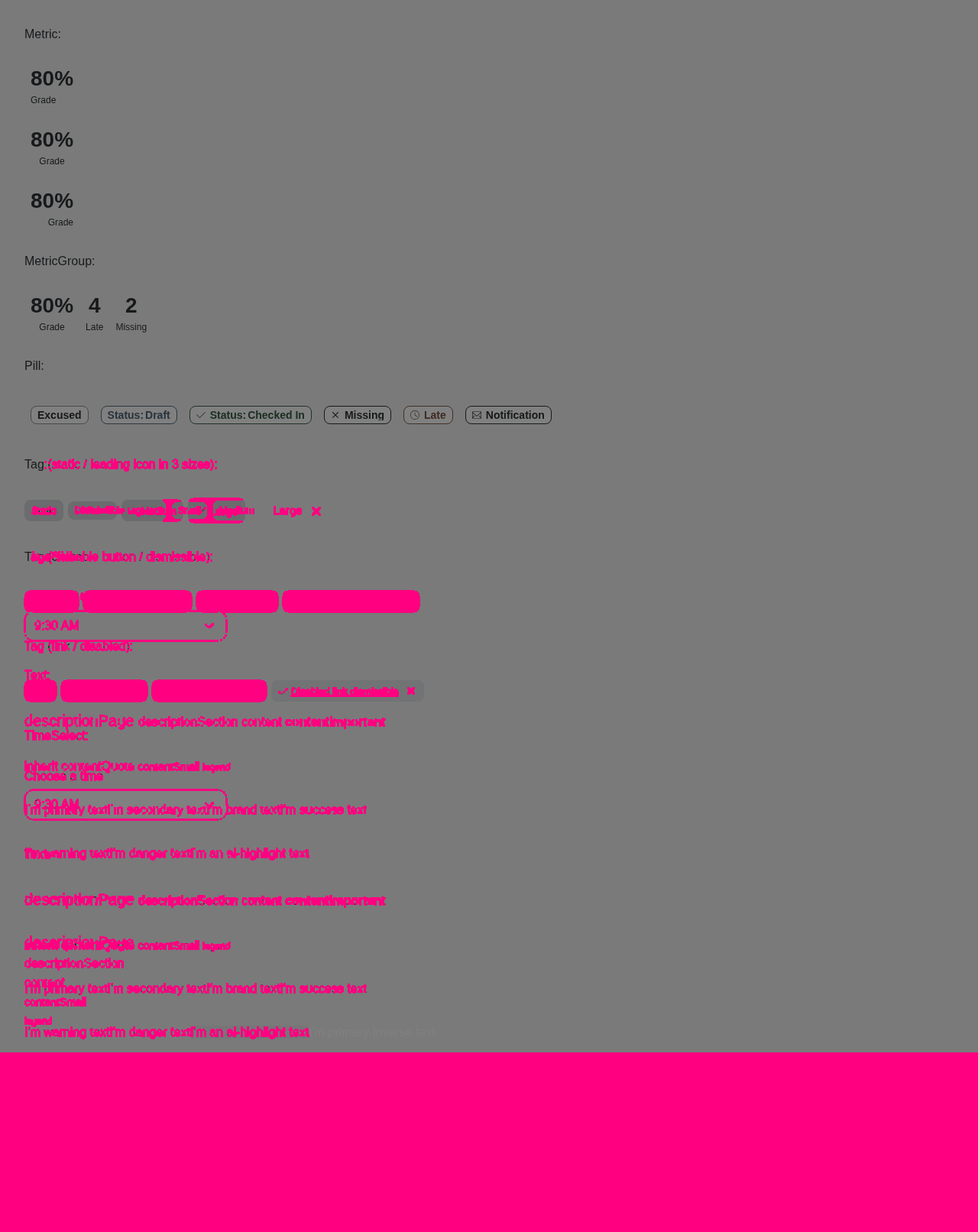
Visual regression reportCypress suite: ❌ Failing — see the run logs. Visual diff:
Accessibility (axe):
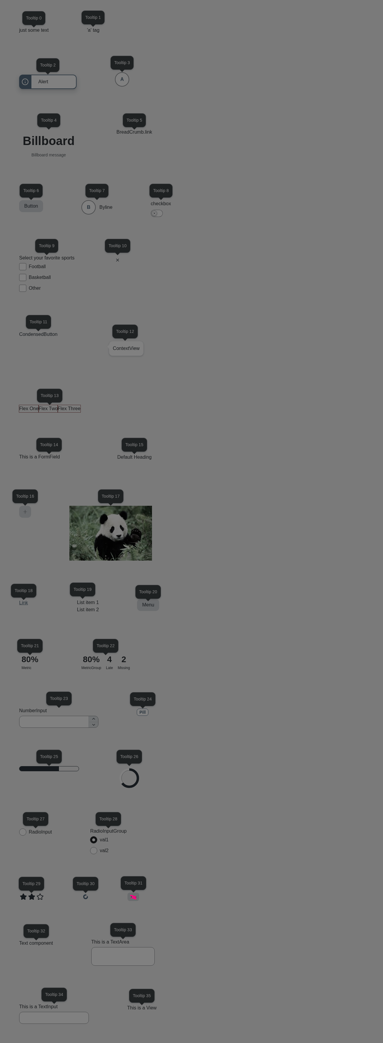
📊 View full report — click a screenshot's ⚠ badge to see each violation boxed on the image, with the offending element named and contrast failures shown as color swatches. Diff images (8)select-canvas.png — 2979 pixels differselect-dark.png — 8804 pixels differselect-light.png — 7949 pixels differsmall-components-canvas.png — 311024 pixels differsmall-components-dark.png — 342361 pixels differsmall-components-light.png — 330282 pixels differtooltip-dark.png — 66 pixels differtooltip-light.png — 65 pixels differBaselines come from the |




|
This looks PERFECT! the only thing that was missed is the color of the tag on the rebrand light theme...in that theme the tag should be the opacity navy that is used for our secondary buttons! |

It’s because this branch is still using v1.5.0 of the tokens. We should update it to the latest version. |


Introduce a v3 of Tag (library v11_8) implementing the new design. v2 is
preserved unchanged and frozen to v11_7 imports; the new ./v11_8 export and
./latest point to v3.

- renderIcon leading icon that auto-sizes to the Tag size
- link/button body via href/onClick, with the label and icon as one
  focusable group (underlined text for links)
- dismissible renders a separate close button controlled by the new
  onDismiss callback; only the close button dismisses the tag
- focus ring moved from the whole tag to the individual focusable elements
  (link/button body and close button)

BREAKING CHANGE: Tag latest now resolves to v3. Dismissible tags are
dismissed via the new onDismiss prop instead of onClick, and the focus ring
appears on the close button / link body rather than the whole tag. Consumers
pinned to @instructure/ui-tag/v11_7 are unaffected.

Co-Authored-By: Claude Opus 4.8 (1M context) <noreply@anthropic.com>
Add the @instructure/ui v11_8 barrel (Tag from ui-tag/v11_8, everything else
still at v11_7) and register v11_8 in the docs versioned-components map so the
docs render the new Tag v3 (with renderIcon/href/onDismiss). Point the umbrella
./latest at v11_8.

Co-Authored-By: Claude Opus 4.8 (1M context) <noreply@anthropic.com>
Use a single Tag with an icon in the README example instead of one per size.

Co-Authored-By: Claude Opus 4.8 (1M context) <noreply@anthropic.com>
A plain clickable Tag (onClick, no href, not dismissible) now renders the root
as the <button> and shows the focus outline around the entire tag. Link and
dismissible Tags keep the per-element outline on the link body / close button.

Co-Authored-By: Claude Opus 4.8 (1M context) <noreply@anthropic.com>
…g v3

Follow the Alert v2 renderCloseButtonLabel pattern: providing
renderDismissButtonLabel renders the close button and supplies its screen
reader label (applied as the button's aria-label). This fixes the axe
button-name violation the separate close button had, since it now has a
discernible, prop-driven (i18n-friendly) name. The dismissible boolean is
removed.

Also refresh the small-components regression page with Tag v3 variants
(leading icon in three sizes, clickable button, dismissible, link, disabled).

Co-Authored-By: Claude Opus 4.8 (1M context) <noreply@anthropic.com>
…g icon gap

Bump the instructure-design-tokens dependency from v1.5.0 to v1.8.0, which adds
the tag.leadElementLabel token. Tag v3 now uses leadElementLabel for the gap
between the leading icon and the label, and iconMargin for the close button
spacing and the tag's start padding (keeping the start edge in sync with the
trailing close button).

Co-Authored-By: Claude Opus 4.8 (1M context) <noreply@anthropic.com>
4937158 to
2d98c33
Compare
3 participants


Summary
v3(libraryv11_8) with the new design;v2preserved and frozen to/v11_7imports.renderIconleading icon that auto-sizes to the Tagsize;href/onClickrender a focusable link/button body (underlined text for links).dismissiblenow renders a separate close button controlled by the newonDismisscallback — only the close button dismisses.src/exports/c.tsandpackage.json./v11_8+./latestpoint to v3.Test Plan
small/medium/large; link underline; focus-ring radius/height.@instructure/uiv11_8wiring and thesmall-componentsregression page update are deferred to the releasebump(umbrella/lateststill resolves Tag to v2 until then).Fixes INSTUI-5130
🤖 Generated with Claude Code